Give yourself to the dark side
by Sandeep Jambhekar
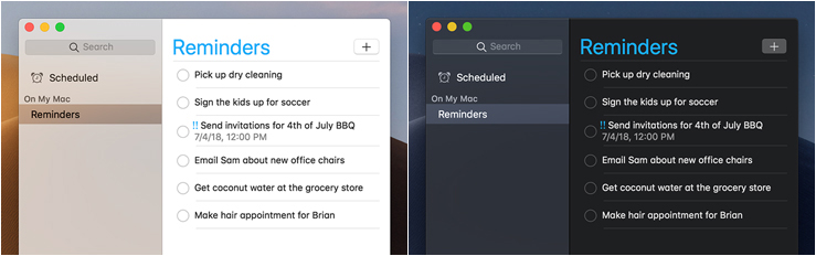
With the final episode of the Skywalker saga hitting theaters, my thoughts wander to the dark side (the proliferation of dark mode interfaces, that is). Packaged with the latest releases of Android, iOS, Windows, and macOS, some variation of dark mode is available. Dark mode is a setting that changes light backgrounds to a dark color and changes the text from dark to light. The result is a pseudo-inverted interface that isn’t exactly the opposite of the light mode, but has mostly dark colors.
The question is, should we be embracing dark mode and exploring dark versions of all digital products we deliver to our clients? Does it make sense to have light and dark variations of products, such as websites, apps, emails, and banners ads? Is it worth adding this new dimension, which will inevitably increase the scope, time, and investment needed to produce these products? Or, is this just another technological terror that we’ve constructed for ourselves?
You may not immediately recognize the power of dark mode, but depending on the platform, there is data that suggests you may experience a 30% to 60% increase in battery life using dark vs light mode. This is significant, especially in the mobile culture we live in today.
Additionally, in low-light conditions, dark mode may help reduce eye strain. It also may help reduce blue light exposure, which may disrupt your natural circadian rhythm if you are exposed to it too close to your bedtime. What I find most disturbing is that elevated exposure to blue light may even increase the risk of macular degeneration.
So should we give ourselves to the dark side? From my point of view, dark mode is not a necessity, it is an option. There may be particular use cases in which dark mode could be a preferred solution, but I don’t believe it should be a default.
In the healthcare space, we are often making interface design and interaction design decisions based on all kinds of human factors. One example is the age range of a patient/HCP population. This particular factor can be useful for defining font faces, font sizes, font weights, color selections, color intensity, iconography, etc. Dark mode may be just another consideration.
We also must factor in how the brand/campaign art interacts with the interface and if interaction elements fit within its defined styles. We don’t want to inadvertently change the feeling of the brand/campaign art by arbitrarily employing dark mode, especially if the overall feeling is to be light and airy.
We don’t want to inadvertently change
the feeling of the brand/campaign art
by arbitrarily employing Dark Mode, especially
if the overall feeling is to be light and airy.
Once we start down the dark path, forever will it dominate our destinies, so we should be very strategic and purposeful about our employment of dark mode. We must use the Force (insights) to determine if dark mode is a good fit and worth the added time, scope, and investment for our clients, because every circumstance is unique. For instance, if our audience is always on the go, using their smartphones as their primary connection to the product, dark mode may be a real option. Currently, I have not encountered any particular patient/HCP type or other factor solely related to healthcare that would dictate the use of dark mode. However, I do see two areas where dark mode should be considered regularly, regardless of the industry.
First, HTML email design and development. Emails can render awkwardly in dark interfaces for some email clients. In these instances, image assets will render as designed, but text blocks could be converted to a dark variation. This mix of modes makes the email seem poorly designed and unreadable. This can cause unwanted brand perception issues, but also, simple friction due to readability issues.
The second is for any products where lighting conditions regularly change, either due to location and/or environmental factors. In-vehicle touch screens are a great example of this. Lighting conditions in vehicles can change due to factors, such as time of day, location, environment, movement. The interfaces of these screens work best when they automatically switch between light and dark variations based on the lighting conditions. We should consider this technique on screens that are mobile or are known to sit in locations of varying light intensity.
Luke Skywalker, the last of the Jedi, once said, “I’ll never turn to the dark side.” He was a wise Jedi, like his father before him, but I think one day, you will be forced into dark mode. In parting, I leave you with a thought from Darth Vader, the Dark Lord himself, “When I left you, I was but the learner. Now I am the master,” of dark mode.
If you’d like to find out how Ogilvy Health can help your product leverage dark mode, please contact Sandeep Jambhekar.
