Designing for Greater Web Accessibility in Healthcare
by William Miranda
Seven Guidelines for Designing a More Inclusive Online Experience for Patients With Visual Impairments
Currently, 285 million people live with some visual impairment—39 million live with total blindness, and 246 million live with low vision. Recently, the US Supreme Court cleared the way to allow a vision-impaired person to sue Domino’s Pizza®. At the time of this writing, Domino’s website and mobile app are designed in such a way that it is impossible to order pizza if you are vision-impaired. This is just an example of the difficulty persons with a disability have when navigating websites. But as the internet grows ever more critical to our daily lives, accessibility to websites for visitors with visual impairments must be considered and should become a higher priority.
Web Accessibility in Healthcare
Why is web accessibility important to healthcare? Online accessibility is especially important to patients since more and more healthcare activities and services are moving to an online service model. Healthcare provider websites are used to find information and schedule care appointments. And now, with the advent of virtual primary care services, the diagnosis and treatment of afflictions can happen entirely online. Proper web accessibility is vital for healthcare organizations to ensure they provide an equal standard of care to patients with and without disabilities.
To date, there has been a prevailing belief that building an accessible website is time-consuming and expensive. It’s an additional layer of effort and cost to be added onto a finished website or app to ensure accessibility compliance. Indeed, this can be true, especially if no thought was given to accessibility requirements at the outset of the project. But guaranteeing access to content shouldn’t be an afterthought. The best way to an inclusive online experience is to make accessibility part of your design process. The following 7 guidelines will help you create inclusive online experiences for patients with visual impairments.
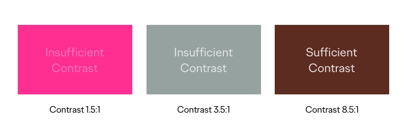
1. Ensure a sufficient level of contrast
People who have moderate to severe vision impairment will find it difficult to read text on a background color of low contrast. As a first step in designing a website or app, consider using sufficient contrast between text and background. Several online apps are available to check the contrast between text and background colors. Aim for a ratio of 5:1.
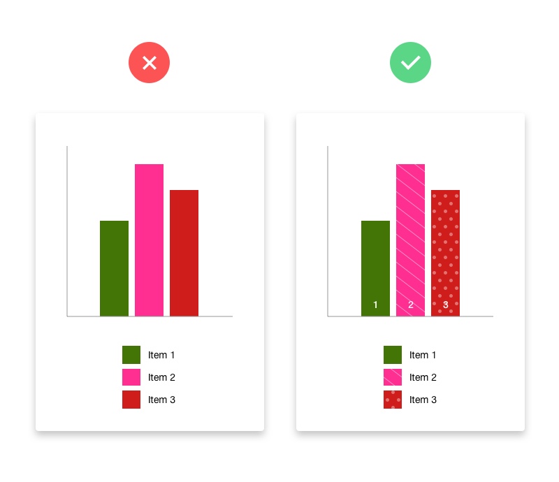
2. Don’t rely solely on color to convey information
People with vision impairment or color blindness will have a difficult time understanding your content if you design with color as the only interface prompt. Add instructional text, labels, or patterns when depicting important information, calls to action, or asking for user input. This additional “visual information” is particularly important when showing an error message. In this case, include an icon along with the error text to grab the person’s attention.
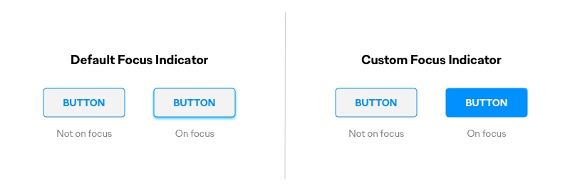
3. Design highly visible selected states
By default, most modern web browsers show thin outlines around page elements when the user selects them. These “’focus indicators” allow screen reader and keyboard navigation tools to show people which item has the keyboard focus. If you choose to overwrite the browser’s default focus indicator, be sure to replace it with another highly visible focus indicator style. Website elements that require visible selected states are links, form fields, buttons, and menu items.
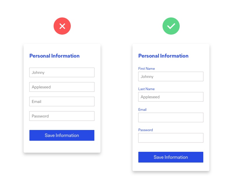
4. Use labels or instructions with form fields and inputs
When designing form input screens, the trend to make our sites more modern and straightforward has been to use placeholder text within form fields. This placeholder text is often difficult to read because it is usually low contrast itself. It’s also challenging to determine what type of input the field requires once a user clicks into the field and the label disappears. In addition, people may be using a screen reader (software that converts text to speech) to navigate through the form (by using the Tab key on the keyboard). In this scenario, the screen reader will dictate the field’s label to the user, so it’s vital to use a relevant label for each field. If the field uses placeholder text, it is usually skipped over by the screen reader, creating confusion for the user.
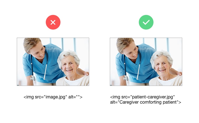
5. Include alternative text for images
Including alternative text (or backup text) for images is an essential component when designing for accessibility. People with vision impairment will use screen readers that aim to describe the visuals on a page. To aid this effort, add an <alt> text attribute to explain what the image depicts and how it relates to the content. If the image is for design purposes only, or if it is redundant, then you can add an empty <alt> attribute to make screen readers skip over it. On some screen readers, if an <alt> attribute is not added, the reader will say the image’s file name. This missing attribute can create confusion for the user, especially if the file is named in an inappropriate manner.
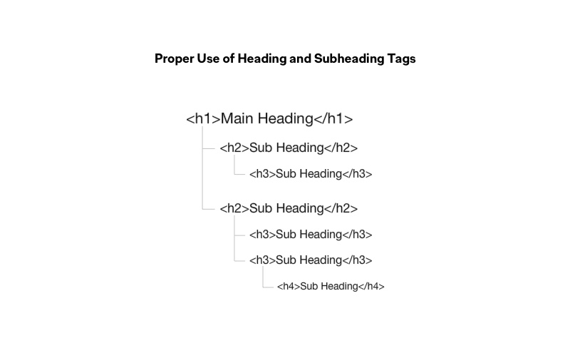
6. Make sure webpages have clear content hierarchy
On a webpage, heading and subheading text, expressed by HTML markup, forms the content flow—both visually for sighted users and verbally for screen readers. This flow is read by screen readers to assist in navigating the page and can be used to jump through sections of page content quickly. For a screen reader to dictate a logical progression of content, the content must use heading and subheading tags (<H1>, <H2>…) correctly. For example, there should only be 1 main heading tag (<H1>) on a page, and then more subheadings as needed.
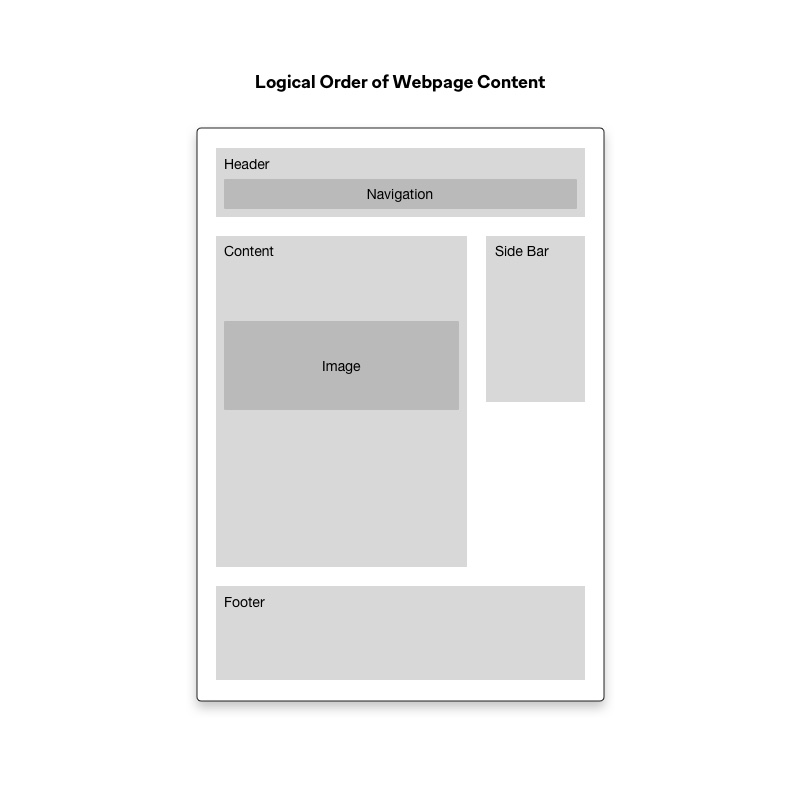
7. Support keyboard navigation
Keyboard accessibility is a vital part of designing for inclusivity. Vision-impaired people who are using a screen reader or people with motor disabilities who do not have precise muscle control to use a mouse will depend on a keyboard to navigate a website. The Tab key is often used to progress through content, so the order of the interactive elements, navigation, content, and form fields must be logical and intuitive. Content should be capable of being tabbed in the correct visual hierarchy of the screen. That is, left to right and top to bottom, with the header first, then main navigation, then content and buttons and other inputs, and lastly, the footer information.
If implemented correctly, these guidelines can help your website conform to level AA of the Web Content Accessibility Guidelines (WCAG 2.0). There are 3 levels of accessibility compliance: A, AA, and AAA. Level AA means the website will work with the most commonly used assistive technologies such as screen readers, navigation aids, display magnifiers, and speech recognition tools.
So, is your website accessible?
As a next step, I recommend putting your website through an accessibility audit to evaluate the its current state of accessibility. Several online tools exist that can give you a general level of accessibility rating. However, the best method is to have a manual audit performed. With the findings, you can determine a plan for updating as per the guidelines above, or potentially bring in someone to manage the process.
If you’d like to find out how Ogilvy Health can help your website achieve a higher level of accessibility, please contact William Miranda at william.miranda@ogilvy.com or Sandeep Jambhekar at sandeep.jambhekar@ogilvy.com.
