Is the way you communicate information all wrong?
by Vanessa Gaby
Edward Tufte thinks so
- Edward Tufte
- Hates
- Bulleted copy
He also hates PowerPoints and pie charts. In fact, he’s got a very specific list of do’s and don’ts which fly in the face of how we, as marketers, were taught to present information. Who is this guy, and why should we listen to him? Should we take his ideas as facts, or simply opinions?
Let’s start by understanding Tufte and his perspective.
Edward Tufte is a statistician, artist, author, lecturer, and professor. He’s taught courses at Princeton and Yale in policy-making, statistics, information design, political economy, public opinion, democratic theory, researching, and writing. He got his bachelors degree and PhD from Ivy League schools, and creates giant outdoor sculptures in his spare time. A true Renaissance man, Tufte is known as “the DaVinci of data” and considered to be the father of data visualization. Lately he’s been traveling the country teaching his popular one-day course, Presenting Data and Information, which I was lucky enough to attend this August. As a copywriter, I’m always looking for new ways to showcase data, so I expected to see some fancy graphs and charts. What I got out of the course was so much more.
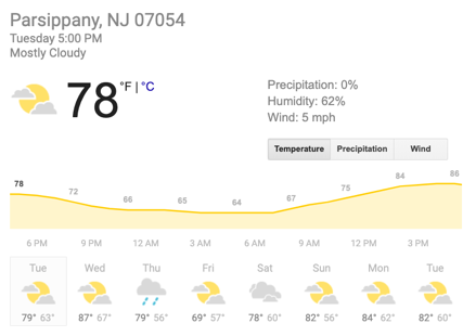
Tufte began his presentation by showing a digital weather report, the kind you’d find on weather.com. He started explaining the different elements of the page: Was it necessary to show an illustration of clouds or was it enough to just say “mostly cloudy”? Do we need to read today’s temperature and see the weekly temperature trends? At first this seemed extremely basic. But I soon figured out what was going on. He was getting me to think differently.

In order to process the large amounts of information we’re exposed to daily, we often gloss over details and takeaway only the most obvious information (ie, it’s 78 degrees out). But if we can take the time to look more closely and truly understand something—even as simple as the weather—we are a more valuable source of information to those around us. And if we, as marketers, can put more thought into the details of our communications, we are empowering our audience to themselves be that source of information. Making people feel smart makes them feel good about themselves and, by extention, you/your product.
My entire job is revolves around how information is presented. Under tight timelines, it’s easy to fall back on the basics: show a chart, add some bullets, keep it short and telegraphic. But Tufte was saying things that sounded slightly blasphemous in the world of pharmaceutical advertising. In his opinion, everything we do to simplify information and coddle our audience is wasted time. He doesn’t believe in talking down to people; he thinks you should make them smarter by pushing them to slow down and process all the information in front of them.
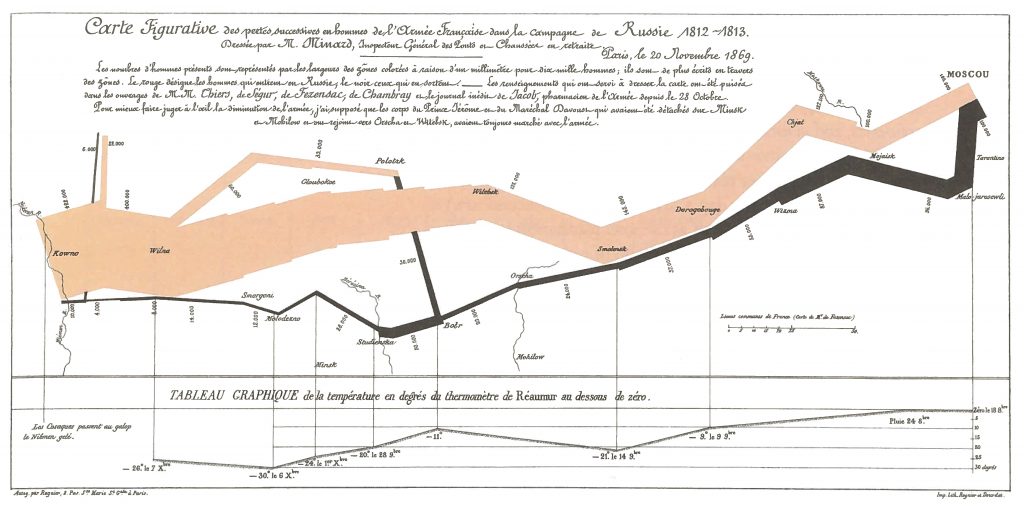
An example that Tufte presents as “one of the best statistical graphics ever” is the Napoleon’s March chart below. At first glance, it’s overwhelming and busy. But when Tufte started to explain the chart, it made perfect sense. You could argue that a chart that needs to be explained isn’t a good chart. Then again, a strong argument could also be made that taking the time to figure things out—rather than being spoon-fed information—isn’t going to kill anyone. And it could actually help the viewer consider the information from an entirely new perspective.

Here’s what the chart means: The tan line on the left that starts out thick and gets thinner represents the number of soldiers who started Napoleon’s March during the French invasion of Russia in 1812. As the men travel towards Moscow, many die and the line thins out, showing the scale of lives lost to this war, and at which geographical points this happens. The black line, significantly thinner than the tan one, shows the troops heading back towards Europe. The temperature scale on the bottom chart explains how the icy Russian winter claimed the lives of even more men. What started out as 422,000 soldiers had dwindled down to just 10,000 by the end. This is what Tufte calls a multivariate chart, as it manages to show comparisons, contrasts, scale, and differences, answering many questions at once for the viewer. Again, we usually strive for the simplest display of information for our customers, but, with Tufte’s logic, if we rachet up the complexity, it may be more effective for our brands. If we consider the fact that much of our information is presented/explained by a sales rep, this approach starts to make more sense.
Another concept that Tufte strongly encourages is credibility. He feels that a presentation is “a moral act as well an intellectual activity.” Cherry-picking, skewing, or misrepresenting data will ultimately lose the trust of your audience. So it’s important to always be transparent—present the information honestly and provide accessible sources and references.

Are Tufte’s viewpoints correct? Like much of what we do as creatives, this is highly subjective territory and “right and wrong” are beside the point. A famous quote of Tufte’s—“to have an open mind, not an empty head”—is probably the most important takeaway from his teachings. We need to think about and challenge both the information presented to us and the way we present it; to neither be overly skeptical nor overly trusting. A departure from spoon-feeding and a comfort with complexity will make us all a little smarter. That may be an uphill battle in this fast-paced digital age, but it’s one worth fighting.
Learn more about Edward Tufte by following him on Twitter or visiting his website.